
I'm no big fan of colour. I'm very happy with minimalism in just about all areas of life. However, when I saw the Pantone Color Guide for this autumn, I was pretty intrigued by some of the tones (warm taupe, spicy mustard, sharkskin) and the style pairings of them.
Easily, my favourite of them is the sharkskin, a soft but definite grey as it blends with my usuals. But what I really fell in love with that was out of my "norm," was the combination of a muted tone such as the grey with a very fall friendly rusty or mustard toned pop.
I was sure, after already clicking "confirm order", that I was going to absolutely hate this burnt mock neck knit. What in the world was I thinking? I'll never wear it. I can't pull that off. Does it even go with anything? I'm so glad that I did though. It really seems like a bold colour but when combined with other colours that are muted or monochromatic, it's really not that overwhelming.
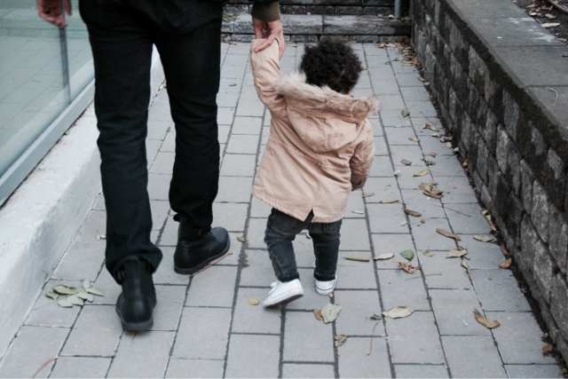
I tend to fill R's wardrobe with minimal tones as well, but even for him, it doesn't hurt to add other warm hues like camels or the occasional (big trending) olive for the season. As long as it's all easily combined and practical for his toddler adventuring, like this outing we took as a family to check some coffee shops and health food stores, then it works for me.


I highly suggest checking out the Pantone 2016 colour chart and shaking things up a little this season. We did, in more ways than one.
Browse the style or shop both our looks here, via ShopStyle.
Small business brands: baby scarf (www.mymila.ca) teether (www.minimomo.com)
XO, Olivia Murray.
No comments
Post a Comment